.
Boldly, Premium Subscription Staffing for Business
The Challenge
Worldwide101 has been the market leader in the Virtual Assistant space for many years. Last year (2018), as part of their goal to continually innovate, to lead the industry, and to appeal to customers at larger companies, they changed the way of speak about what they do from “virtual assistants” to “premium subscription staffing”. And the next step in that evolution is changing the company name from Worldwide101 to Boldly.
SERVICES PROVIDED
BRANDING
LOGO DESIGN
I helped Worldwide101 to evolve towards their brand new name and identity and embrace their new missions and visions for a better online experience for their users.
My approach
Firstly I always have much contact with my clients about the company, people and what they want to solve with a potential new logo. I always find it important to know the people first so I can find solutions which connects not only with the consumers, but also the people who work there. I often start with my research and understand what their current market looks like and if there may be any competitors involved. During the project I created many potential concepts and talk these trough with my client and we’ve been growing towards a perfect mark that captures all their visions and missions, and still keeping it human and appropriate.
I'm so passioned when it comes to kicking off a new project and discover potential directions which may be a perfect suit. Sketching out rough ideas and browse on the internet (and books) to help find that spark for new inspiration.

Rough sketches when I dive into a new project. I tried to do something creative and appropeate within a lettermark B.
Visual
identity
Due the change of naming of the company we also had to rethink the meaning of the new name Boldly. I’ve been doing research on the company and laid down their plans to evolve their business for the next years. It was key that they wanted a suiting logo for their new name and ideas such as: humanity, friendly, handshake, connecting where highlighted in the very start of the project to focus on. It needed to embody the name and also keeping in mind what Boldy provides with their services. I often focus on a mark first. Once the mark is perfect there is the time to find a complimentary typography choice which embrace the whole visual identity. Colors, typography where all cleverly combined to make a perfect match which holds all the energy and joy which the people at Boldly bring to their audience and consumers.
Several high potential marks where invented and closely discussed with my client. I find it important to always stay on the same page but keep room for creativity and bringing in the WOW-factor to my designs.
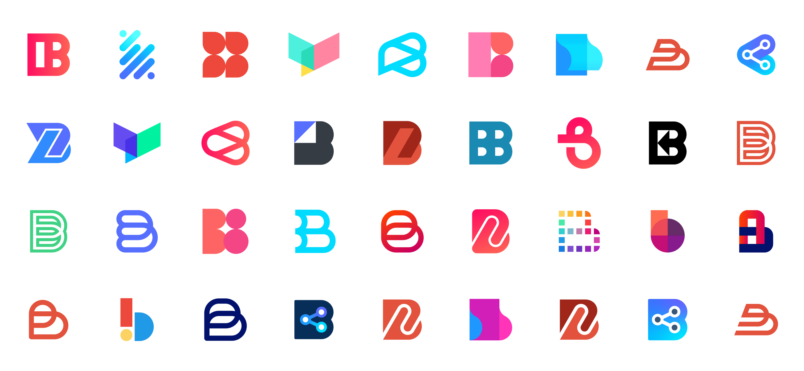
All of my concepts and revisions in one shot. Many potential winners but only one which was a perfect match for my client.
Revisions
At this stage, my client decided to go with a specific concept. It had almost everything they where looking for but only needed some subtle tweaks to make it work more fluently. After some conversations with my client we had a clear idea on how this could be improved without loosing too much of the inital concept. The client asked me to focus on more friendly forms, warm and vivid colors and also make the mark just slight better balanced. I got back to my illustrator and looked how this concept could be improved without loosing the vibe and connection it forms.
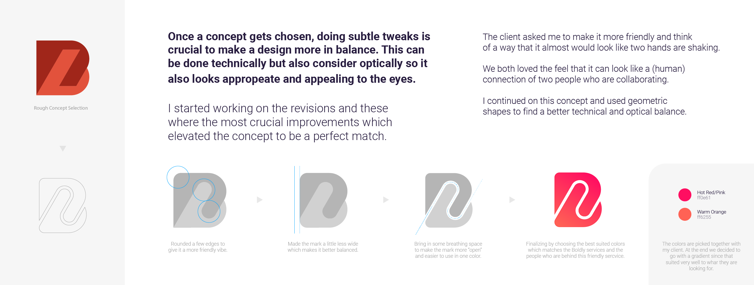
When it comes to revisions, I always try to be as efficient as possible and to truly understand my clients whishes.
Typography
When it comes to chosing the right font for a logo, I often focus on what I want to achieve with it. I always look for a font which compliments a logo mark. To keep things visualy balanced and technical correct, I tend to go with clean and strong looking fonts. Sometimes I adjust a font to make it fit the identity better. My client
already had a strong connection with the Hurme font and so I followed his wishes
and made it work perfectly with the already designed mark. Hurme is also one of
my personal favorites so that was a nice little extra.
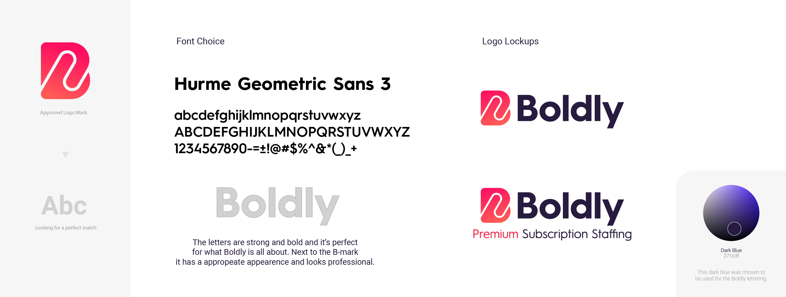
I choose the typography which match a mark wisely so it has a nice visual balance.
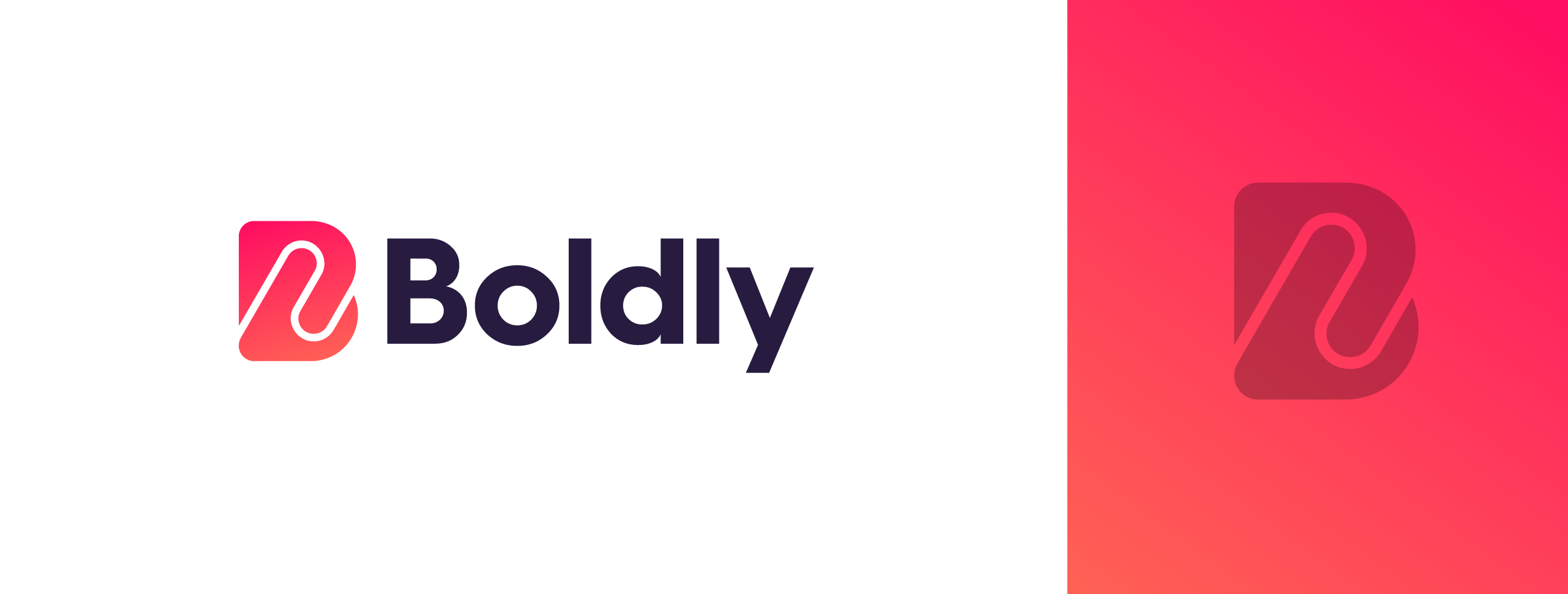
The final logo redesign for www.boldly.com
“Jeroen was a pleasure to work with, both in terms of the great skills that he brought to our logo design project and his friendly, can do attitude. Jeroen came up with some early concepts which showed real originality and creativity even though they weren't yet "the one" and then he nailed it with a design that we hadn't even imagined - for me that's what I like about working with a great designer is when they surprise you beyond expectations. I highly recommend Jeroen.”
Matthew Criticos, Co-founder & Technical Director at Boldly, A Premium Subscription Staffing Company.
Jeroen van Eerden
+31 (0) 624 33 0707
Skype: @jeroenvaneerden1
info@jeroenvaneerden.nl
Dribbble
Béhance
Instagram
Twitter
Facebook
Medium
Jeroen van Eerden
+31 (0) 624 33 0707
Skype: @jeroenvaneerden1
info@jeroenvaneerden.nl
Dribbble
Béhance
Instagram
Twitter
Facebook
Medium
Jeroen van Eerden
+31 (0) 624 33 0707
Skype: @jeroenvaneerden1
info@jeroenvaneerden.nl
Education
2008 - 2015
Communication & Multimedia Design
NHL University in Leeuwarden,
the Netherlands
2003 - 2008
Human Technology - ROC
Noorderpoortcollege in Groningen,
the Netherlands
Education
2008 - 2015
Communication & Multimedia Design
NHL University in Leeuwarden,
the Netherlands
2003 - 2008
Human Technology - ROC
Noorderpoortcollege in Groningen,
the Netherlands
Education
2008 - 2015
Communication & Multimedia Design - NHL University in Leeuwarden, the Netherlands
2003 - 2008
Human Technology - ROC Noorderpoortcollege in Groningen, the Netherlands
Education
2008 - 2015
Bachelor of Multimedia Design
Communication & Multimedia Design
NHL University in Leeuwarden,
the Netherlands
2003 - 2008
Human Technology - ROC
Noorderpoortcollege in Groningen,
the Netherlands
Work Experience
2018 - Present
Juror IndigoAwards and LogoWave
2009 - Present
Freelance Brand identity designer
2018 - 2018
Graphic Designer at Yahoo! Sports
2017 - 2017
Graphic Designer at Google (GSuite)
2016 - 2017
Graphic Designer at Menzis
2015 - 2015
Intern at Junction
Work Experience
2018 - Present
Juror LogoLounge and LogoWave
2009 - Present
Freelance Brand identity Designer
2018 - 2018
Graphic Designer at Yahoo! Sports
2017 - 2017
Graphic Designer at Google Suite
2016 - 2017
Graphic Designer at Menzis
2015 - 2015
Intern at Junction
Work Experience
2009 - Present
Freelance Brand identity Designer
2018 - 2018
Graphic Designer at Yahoo! Sports
2017 - 2017
Graphic Designer at Google (GSuite)
2016 - 2017
Graphic Designer at Menzis
2015 - 2015
Intern at Junction
Work Experience
2009 - Present
Freelance Brand identity Designer
2018 - 2018
Graphic Designer at Yahoo! Sports
2017 - 2017
Graphic Designer at Google (GSuite)
2016 - 2017
Graphic Designer at Menzis
2015 - 2015
Intern at Junction
Awards & Publications
Dribbble 100K Award
LogoWave 5 - 3rd place Award
LogoLounge 10 + 11
Los Logos 8
Branding Elements Logos 4
Logo Talks IV
Logo Talks III
CounterPrint Monogram Logo
Béhance Portfolio Award
Branding Served 17x
Student Show 8x
Wacom Gallery
SVA Portfolio's
Cover Design: Publish (Dutch)
Publish (Dutch) 3x
Advanced Photoshop
Photoshop Magazine (Dutch)
Telegraaf (Dutch newspaper)
Awards & Publications
Dribbble 100K Award
LogoWave 5 - 3rd place Award
LogoLounge 10
Los Logos 8
Branding Elements Logos 4
Logo Talks IV
Logo Talks III
CounterPrint Monogram Logo
Béhance Portfolio Award
Branding Served 17x
Student Show 8x
Wacom Gallery
SVA Portfolio's
Cover Design: Publish (Dutch)
Publish (Dutch) 3x
Advanced Photoshop
Photoshop Magazine (Dutch)
Telegraaf (Dutch newspaper)